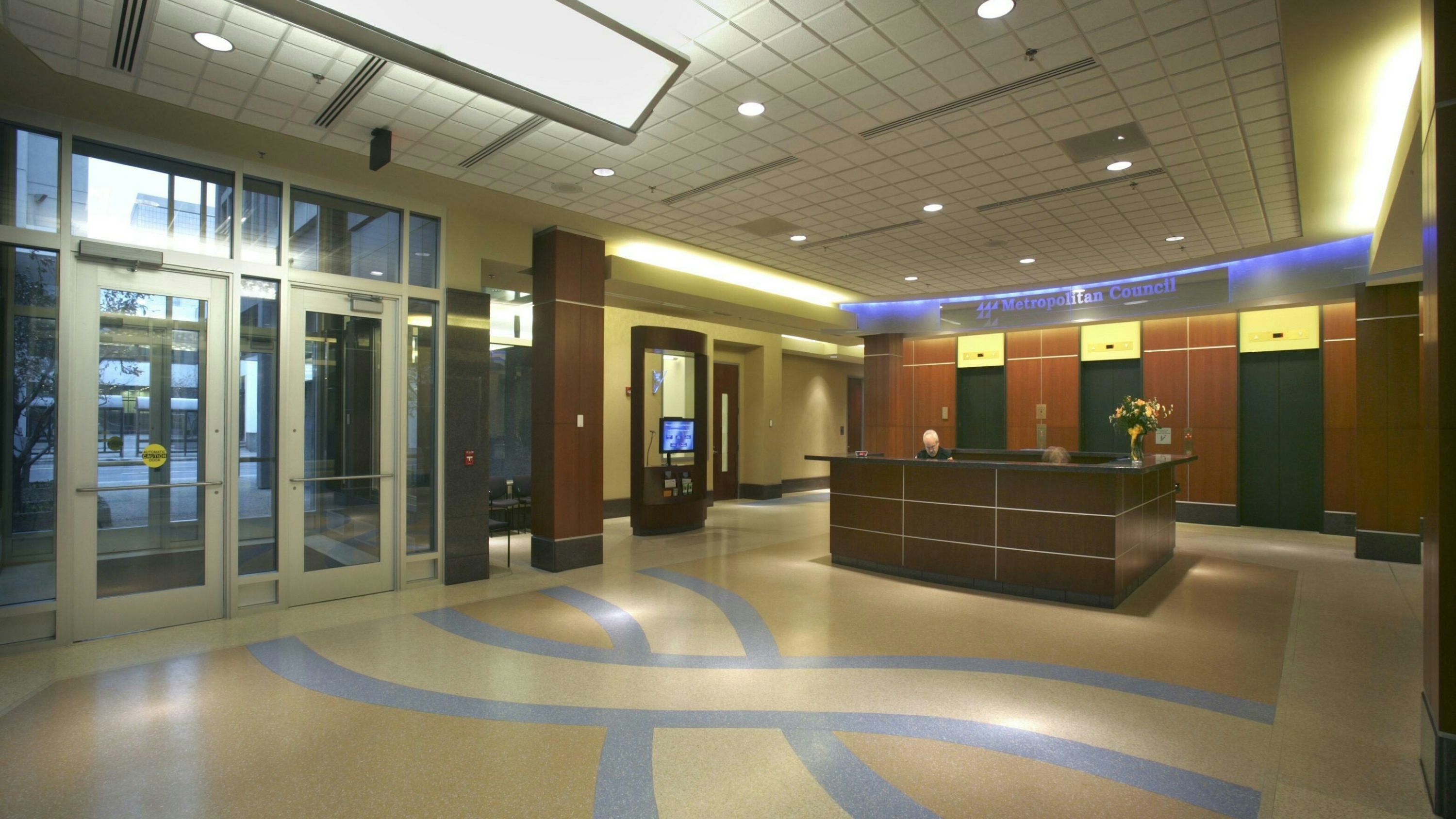
Universal design, also known as “inclusive design,” is the architectural design of buildings and environments that ensures accessibility to all, regardless of age, ability or any other diverse characteristics. Inclusive design places people at the heart of the design process and considers the design details that will help everyone feel comfortable and welcome in the building’s spaces.
When designing government buildings, architects must consider the needs of every unique individual. City halls, courthouses, correctional facilities and many other public sector buildings require an all-inclusive design approach to deliver important services the community relies on every day.
There are numerous ways to incorporate inclusivity into design depending on each project’s goals. Below are four of the most common design elements that create more accessible and inclusive government buildings.
Going beyond code compliance with accessible features
According to the CDC, one in seven U.S. adults live with a mobility disability that inhibits their ability to access building and infrastructure. Ensuring all people, regardless of ability, can access a building is crucial. In the U.S., building codes must comply with the American Disabilities Act. Both new buildings and renovation projects require accessibility updates for individuals with disabilities. These are often considered ‘minimum’ standards and can include wheelchair access, parking spaces close to entrances, alarm systems that can be both seen and heard, accessible elevators and more. Some of our clients wish to take it a step further with accessible features such as automatic doors in multiple locations, hands-free sensors that operate doors and restroom fixtures, flooring texture changes for visually-impaired individuals, spiral ramps leading to higher floors and toilet accommodations designed to help adults who need caretaker assistance.
Use clear and intuitive signage/wayfinding
Building navigation or wayfinding is important, especially in large government facilities. For a wayfinding plan to work, people should understand the intent of the message in under five seconds. The layout should be uncluttered and easy-to-read. This principle parallels the idea of “intuitive use,” or design that is easy to understand, regardless of the person’s experience, knowledge, language skills or current concentration level. The most common mistake is too many signs and too many messages, which leads to confusion and visual clutter. Effective wayfinding strategies often include a color scheme, simple, common language or pictograms, and directional arrows in a logistical direction.
For example, our team shared several of these strategies in a Wayfinding Standards Report for Lake County, Illinois. Lake County identified that the general public experienced challenges when visiting and navigating its downtown Waukegan campus. To address these challenges, our team presented a comprehensive wayfinding strategy that included reducing signage overload and noise in particularly concentrated areas, adding signage in crucial areas and intersections that lack, developing a graphic standard that can be applied to all signage and maps and labeling all stairwells, elevators and bathrooms clearly and appropriately.
Implement privacy restrooms
In 2021, the International Plumbing Code passed two amendments, making privacy restrooms code compliant. This had a significant impact on how architects design restrooms, and allows for the creation of restrooms that are not only beautiful and efficient, but equitable. There are many reasons to implement privacy restrooms in facilities, including public safety and health issues, accommodation for people with special needs, efficient space compared to single-user restrooms and decreased wait times.
Design spaces that are comfortable and reduce stress
Some government facilities like courthouses, jails and police stations can cause individuals to feel uncomfortable or stressed, regardless of reasons for visiting. Architects understand this and aim to create comfortable environments through design elements like colors and natural light that reduce stress, resulting in visitors feeling safe when they need to use the spaces.
Making inclusive design a reality
At Wold, we believe meeting the bare minimum accessibility standards isn’t enough. Seamlessly incorporating all-inclusive design details and solutions to create equity among facility visitors is critical. Our goal is to design government facilities and civic buildings that allow users to have a seamless, stress-free experience.
When our team observed there was little to no existing signage containing braille and bilingual translations throughout the Cook County Oak Forest Regional Outpatient Clinic and adjoining campus facilities, we provided recommendations to go above and beyond for the community. While braille inclusion is standard for ADA compliance, bilingual translations are not. We recommended any new physical signage provide both braille and bilingual translations where applicable and useful.
Inclusive design is not a “one-size-fits-all” approach. We design environments that are sensitive to the relationship between the user and facility. We apply unique, innovative approaches to ensure optimal functionality that caters to all users.
If you’re ready to find the right inclusive design solution for your next project, contact us today. Our team will answer any questions you may have and provide resources you need to make your next project a reality. You can reach our team at 1-888-254-6789.